


The regular customers already knew why they kept coming back. They knew the range, trusted the place and could leave with several headscarves in one purchase. With the move to the town square, the challenge was to get the same value across to a woman meeting the brand for the first time.
SAME CHIC. NEW LOOK.
CHIC LOOK
01 / ABOUT THE PROJECT
CHIC LOOK has been making and selling headscarves for more than 20 years. The move from the factory store in the warehouse to a store in the town square was a chance to give the brand a presence that reflects its experience, its expertise and its huge range. We took the move from the strategy and the visual identity to the opening campaign.
02 / THE CHALLENGE
THE CHALLENGE
03 / THE SOLUTION
THE SOLUTION
We positioned CHIC LOOK as the home and source of headscarves. Direct production, a range that keeps changing and a good-value price give a reason to come, choose several headscarves and come back the next time you want something new.
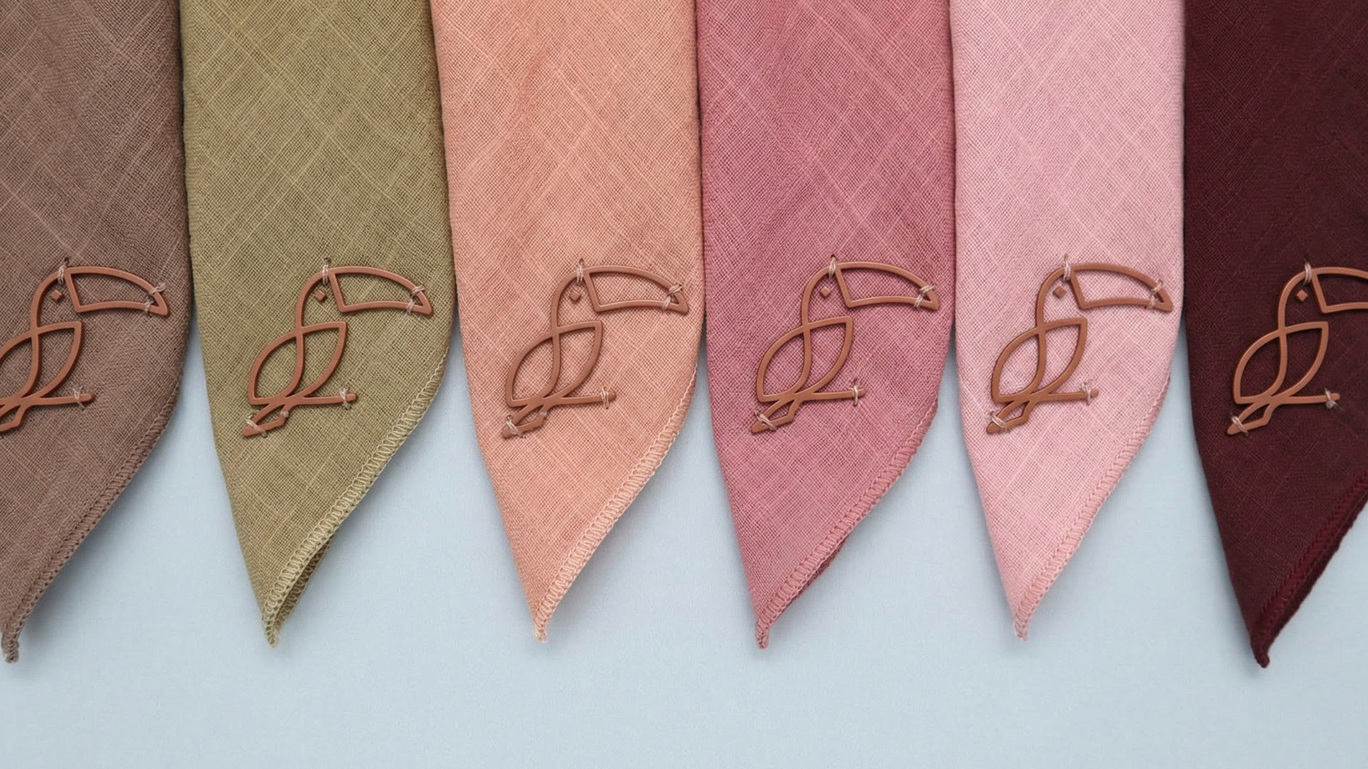
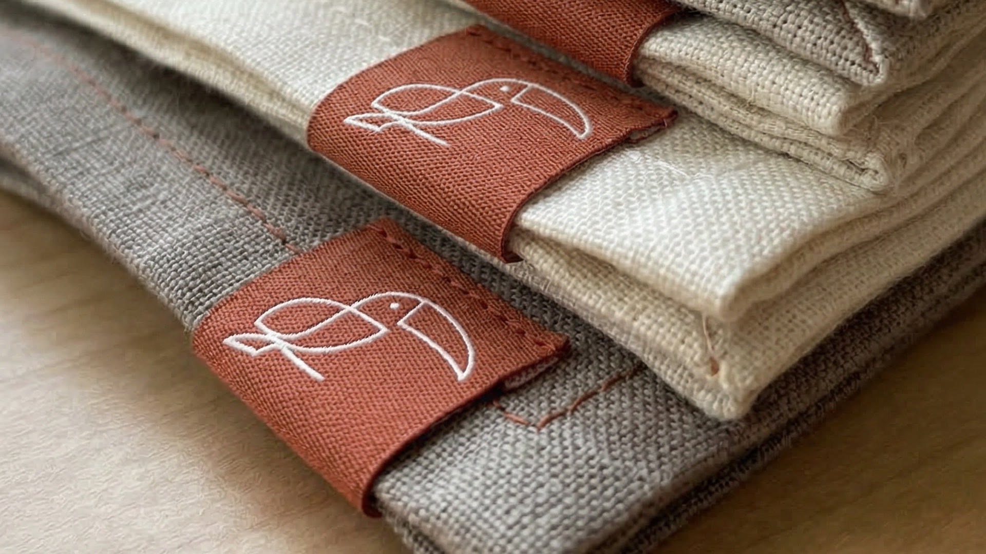
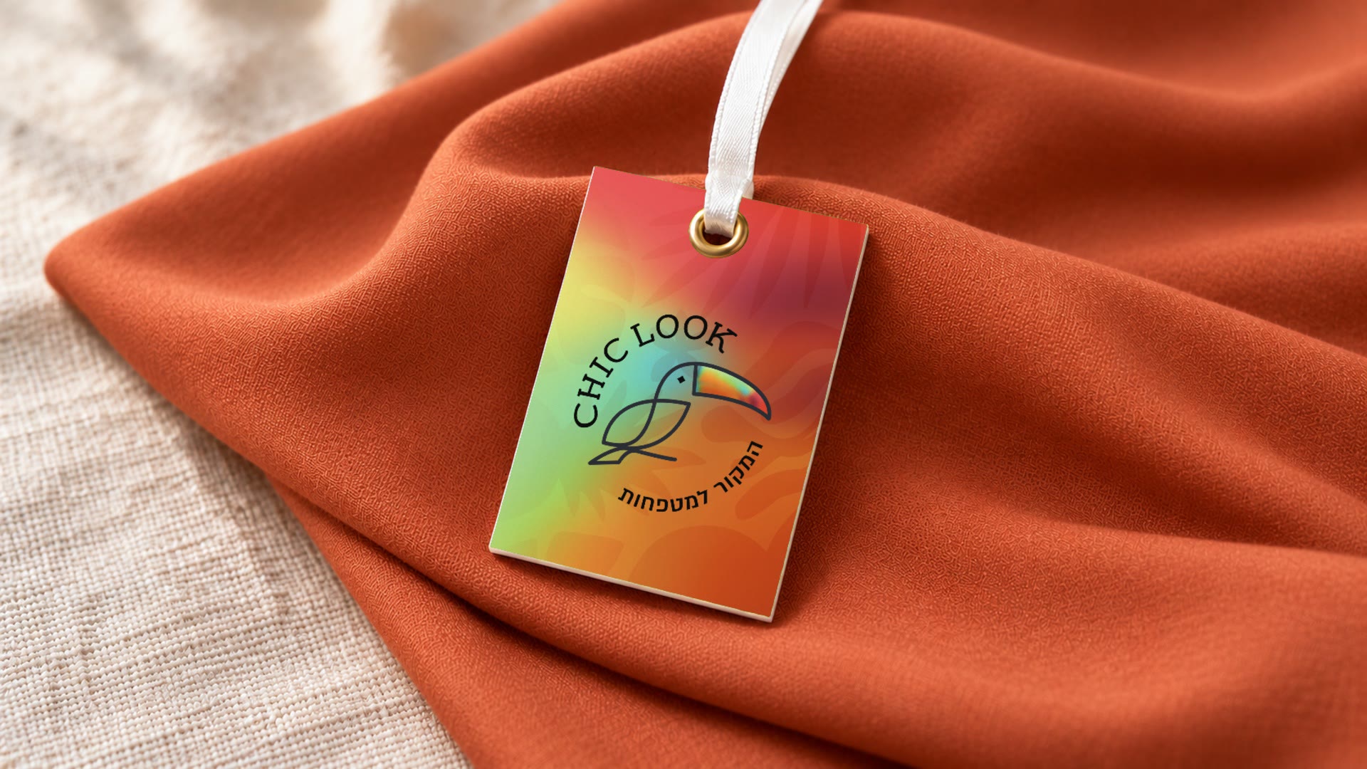
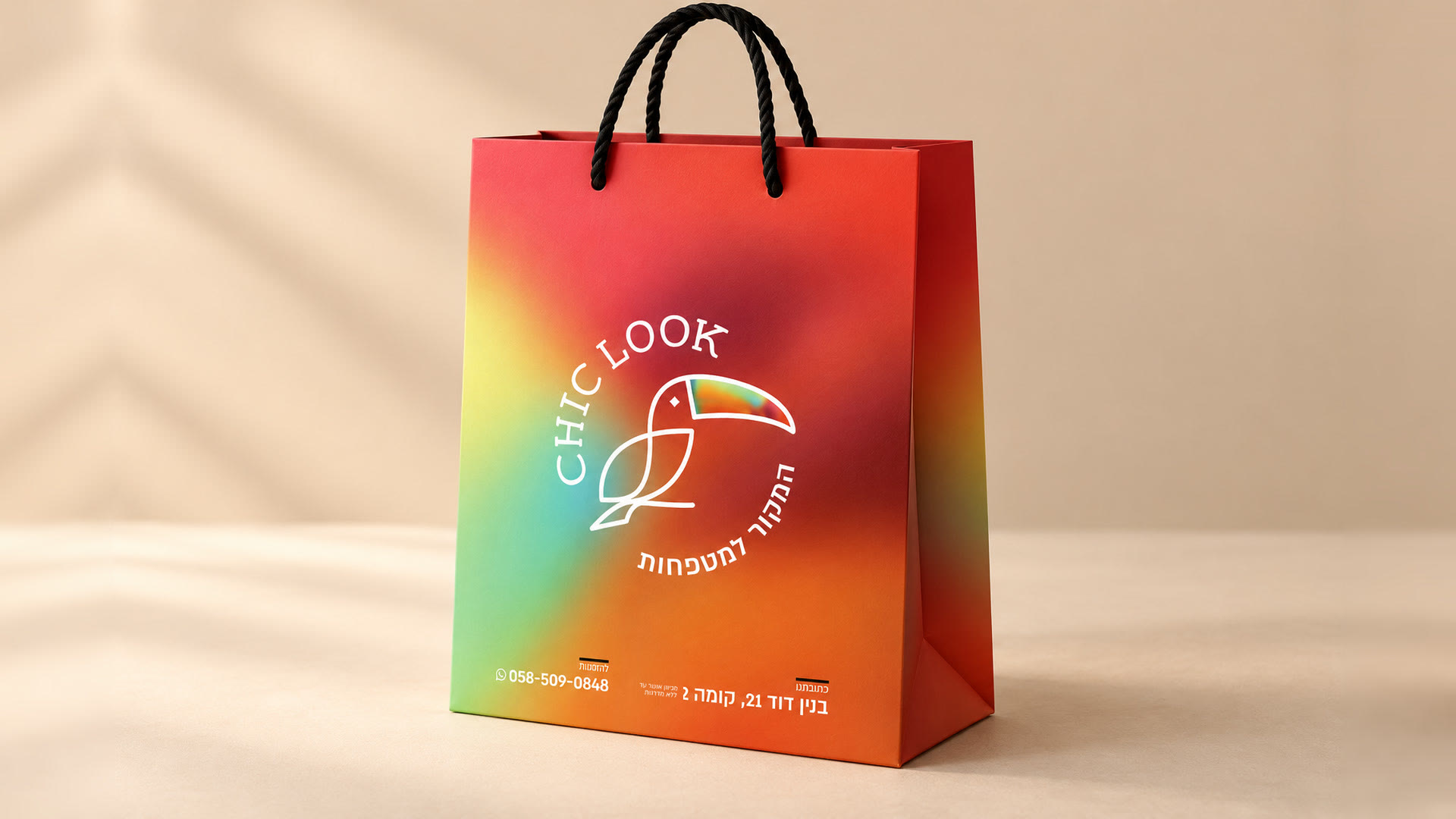
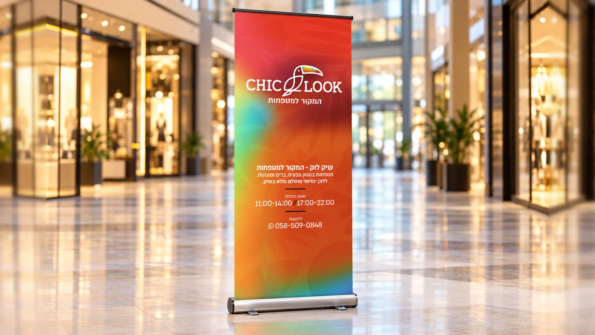
The opening campaign tied the new address to the new look. The identity went with the whole shopping experience, from the sign in the square to the details you take home, from the sewn label and the hang tag to the bag.
04 / THE PROMISE
THE PROMISE
A range that keeps changing, at a price that lets you choose more than one headscarf.
05 / THE LANGUAGE
THE LANGUAGE
We chose a colourful language with a fashionable character to express CHIC LOOK’s range and the fun of choosing. The toucan gave the brand a sign that is easy to recognise, and the red from the previous logo kept the link to the store customers already knew.
06 / TESTIMONIAL
WHAT THE CLIENT SAYS
In their own words, translated from Hebrew, shortened and otherwise untouched.
The branding put me in a different place. Suddenly people treated my product differently. Girls ask for the bags: “We want pretty bags.”
Tzipora Rosenblat, CHIC LOOK