


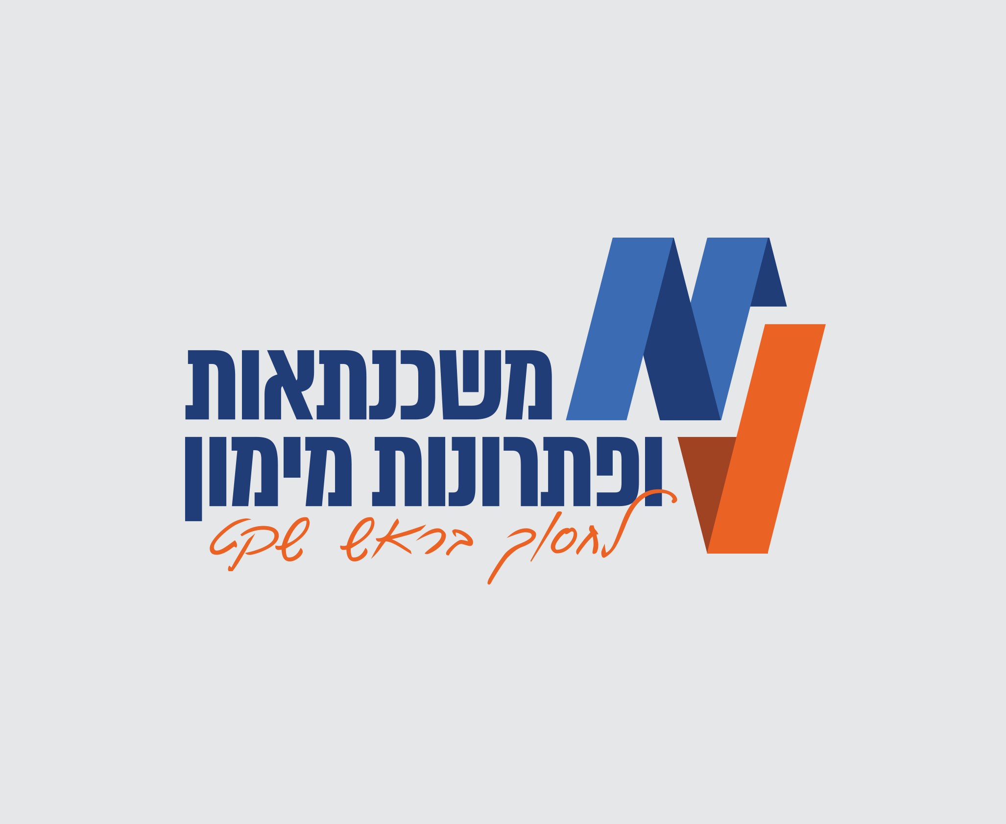
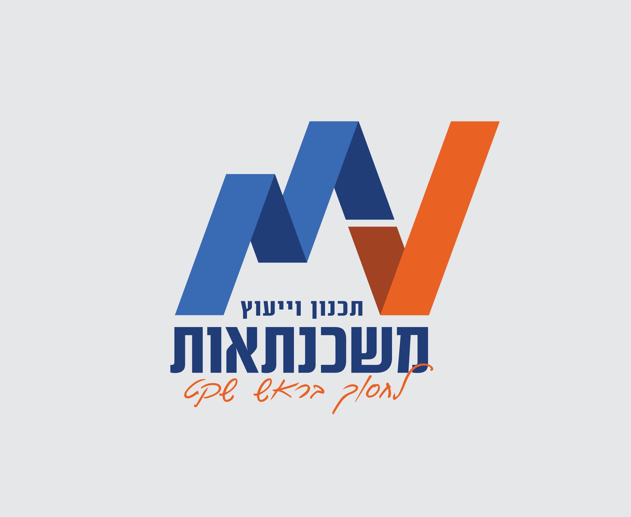
Malia loved the original logo and wanted to add the words “financing solutions” to it. The challenge was to give both lines of text a natural place inside the logo, while keeping the shape and the colours that made it recognisably MV.
SAVE, WITH PEACE OF MIND
MV
01 / ABOUT THE PROJECT
We built the MV Mortgages brand in 2015. Since then, Malia Weinstock’s business has grown from mortgage advice into financing solutions too. In 2024 we came back to the brand to give the new field a place in the logo, refresh the visual language and build a website that presents both lines of work.
02 / THE CHALLENGE
THE CHALLENGE
BEFORE / AFTER
2015 → 2024
Drag to compare the logo before and after the refresh.
03 / THE IDEA
THE IDEA
We took the six parts of the original logo and rearranged them. We aligned the peaks, raised the angle and brought the orange ✓ down to the level of the second line. That way, “financing solutions” became part of the logo’s structure, beside the name.
04 / THE SOLUTION
THE SOLUTION
The MV symbol looks like a graph that ends in an orange ✓, the moment the approval comes through. In the refresh, we gave that mark a role outside the logo too. It became a recognisable element of the brand’s visual language, and it runs through the new website as well.
05 / THE PROMISE
THE PROMISE
Personal guidance in choosing a mortgage or a financing solution, with a clear picture of the options before you decide.
06 / THE LANGUAGE
THE LANGUAGE
We wove the logo’s stripes at their original angle, 14.4°, into textures inspired by mortgage tracks. Blue on dark blue and orange on dark orange run from the back of the business card and the envelope flap to the cups and the bottom of the website. Dark blue leads the palette, and Almoni keeps the text clean and legible.