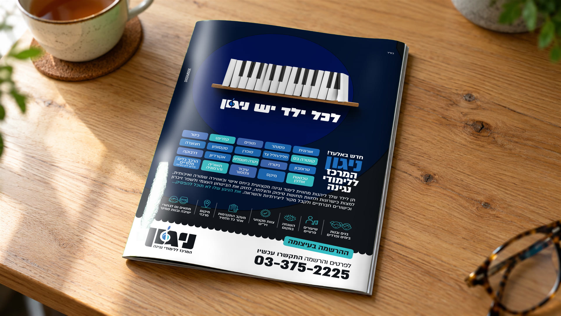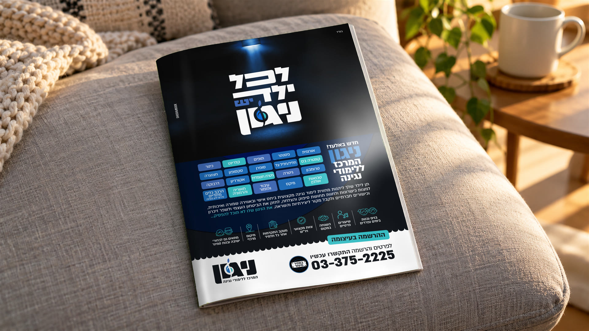



The children wanted to play. The parents wanted to know who would teach them, how they would progress and whether the setting fits their values. We built the positioning around what the centre really gives. Private lessons, progress tracking and a setting made for the Haredi community, with a God-fearing staff, supervision and separate study days.
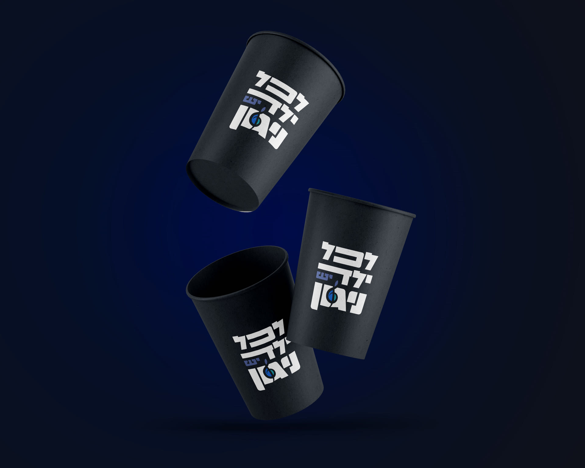
EVERY CHILD HAS A MELODY
NIGUN
01 / ABOUT THE PROJECT
NIGUN is a centre for music lessons for children and teenagers from the Haredi community in Elad. Ahead of the centre’s opening, we shaped the strategy, chose the name and developed the visual identity and the launch campaign.
02 / THE CHALLENGE
THE CHALLENGE
03 / THE SOLUTION
THE SOLUTION
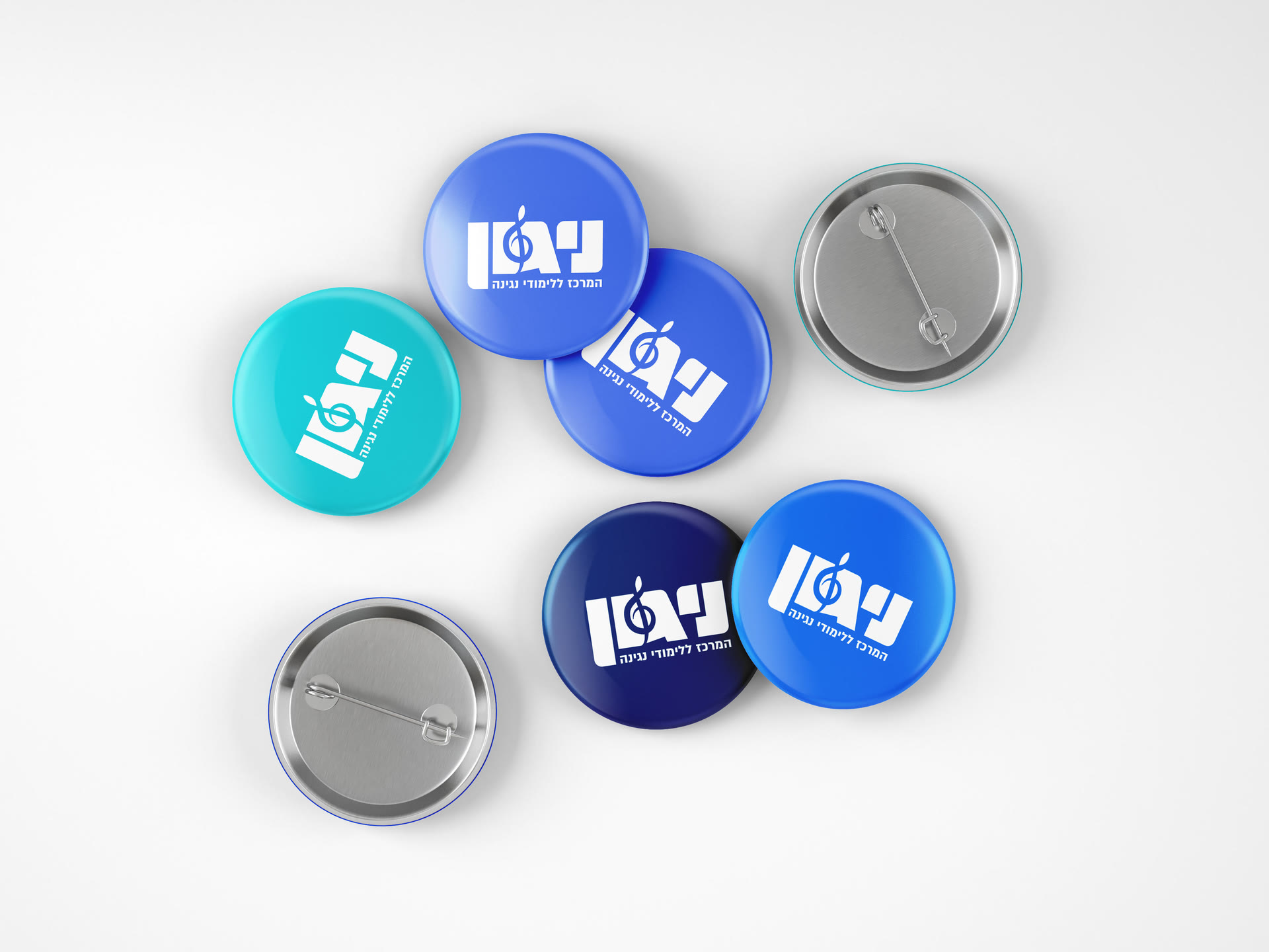
We chose the name “Nigun”, Hebrew for a melody, because it joins the world of Jewish music with the way children learn at the centre. The name is familiar from the world the pupils come from, and its singular form leaves room for each pupil’s own pace.
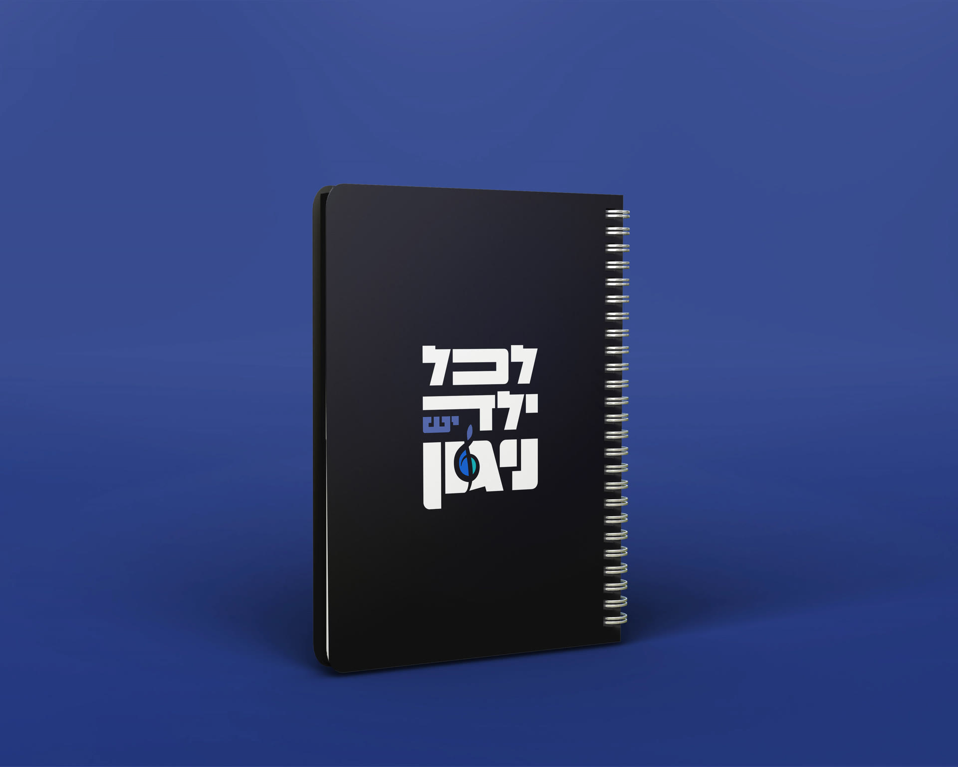
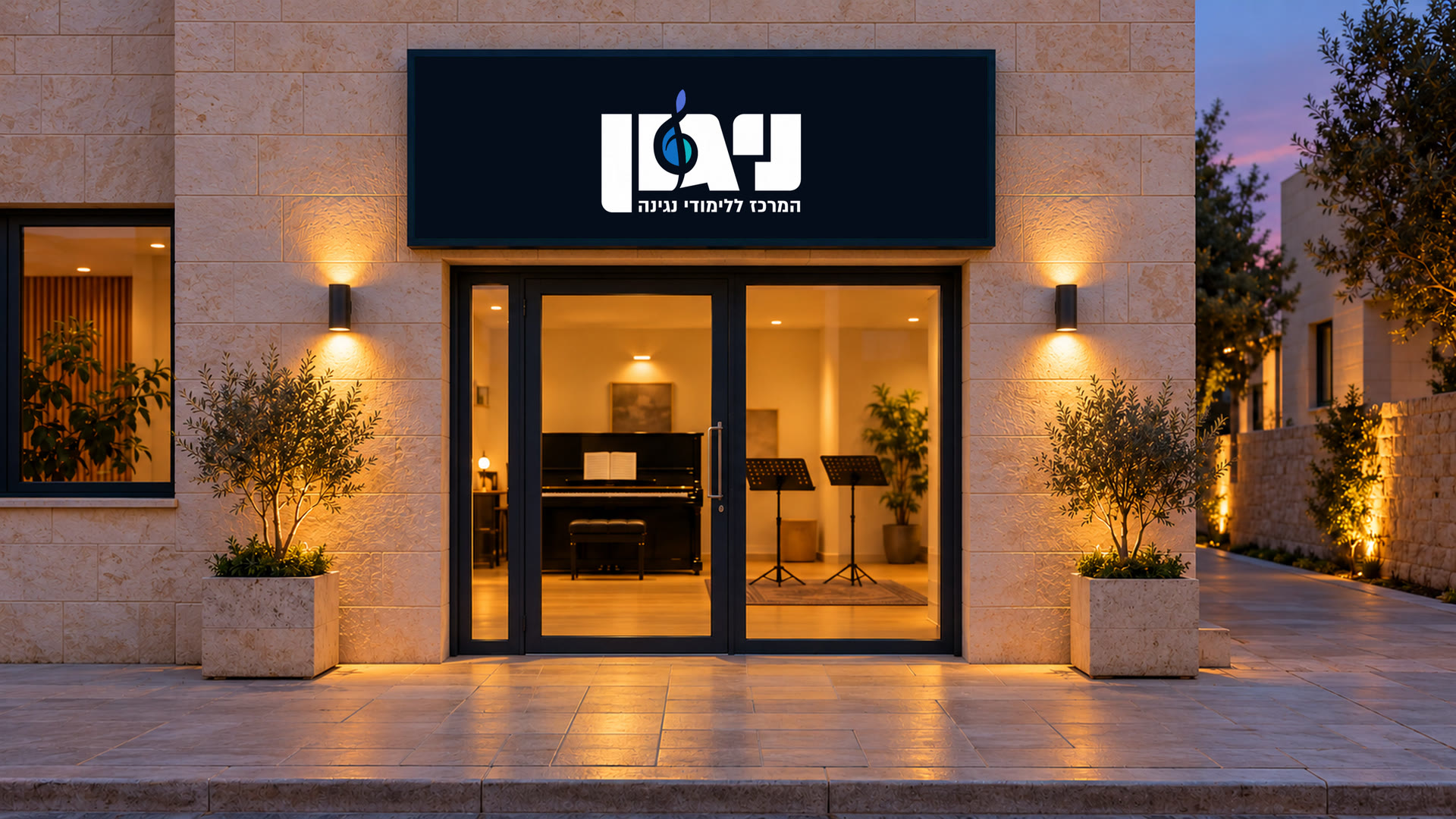
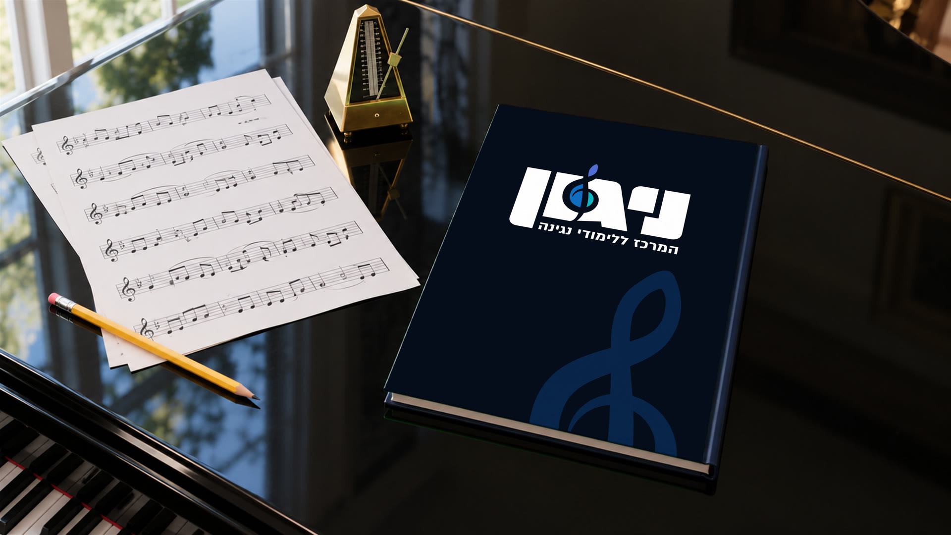
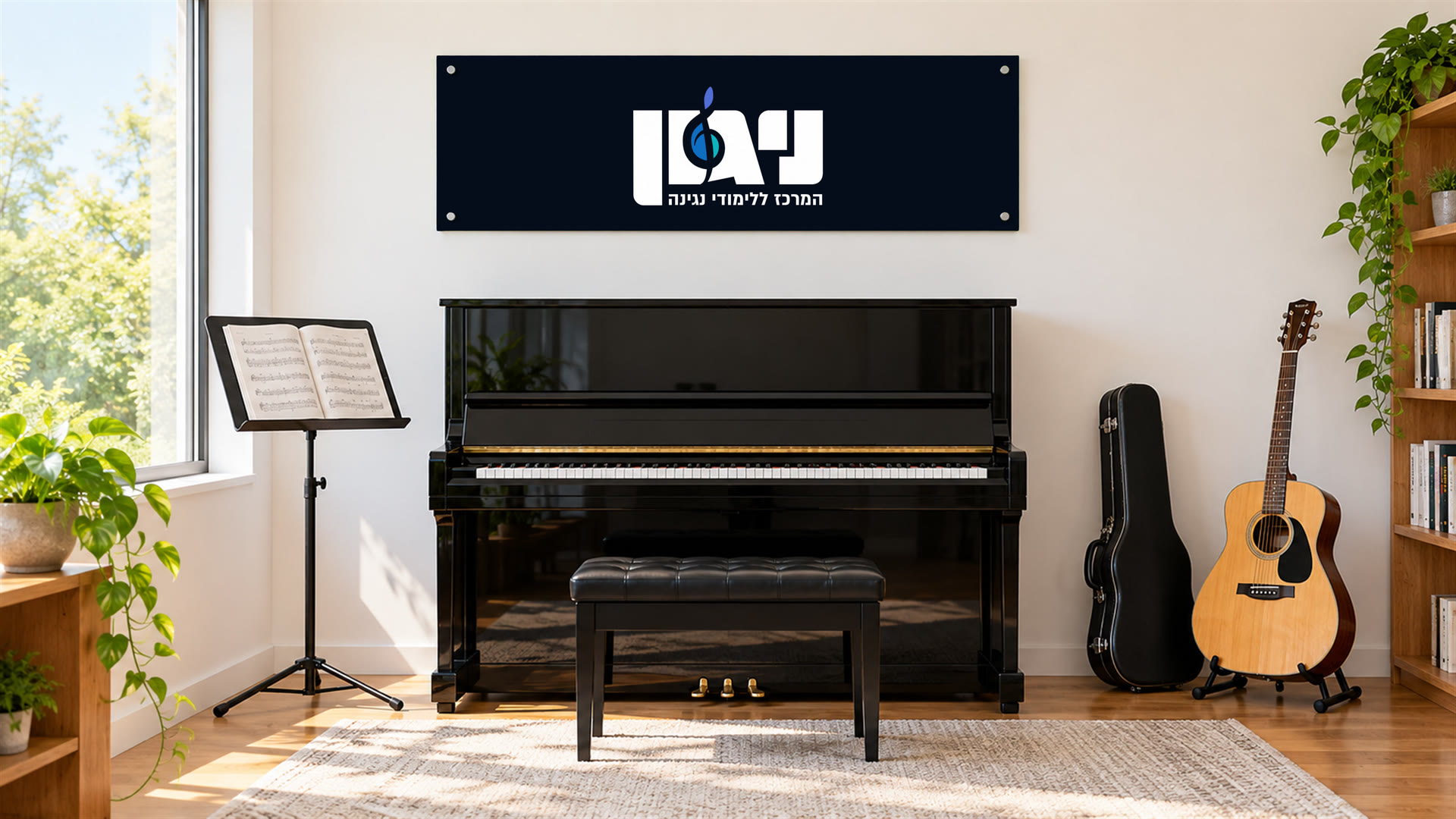
The launch campaign took NIGUN to the magazine, the street and car windows. Inside the centre, the same identity carried on from the illuminated sign on the front to the music rooms and the sheet-music binder that goes with each pupil from lesson to lesson.
04 / THE PROMISE
THE PROMISE
With a teacher who knows them and lessons that move at their own pace, every child gets a place to discover their own music.
05 / THE LANGUAGE
THE LANGUAGE
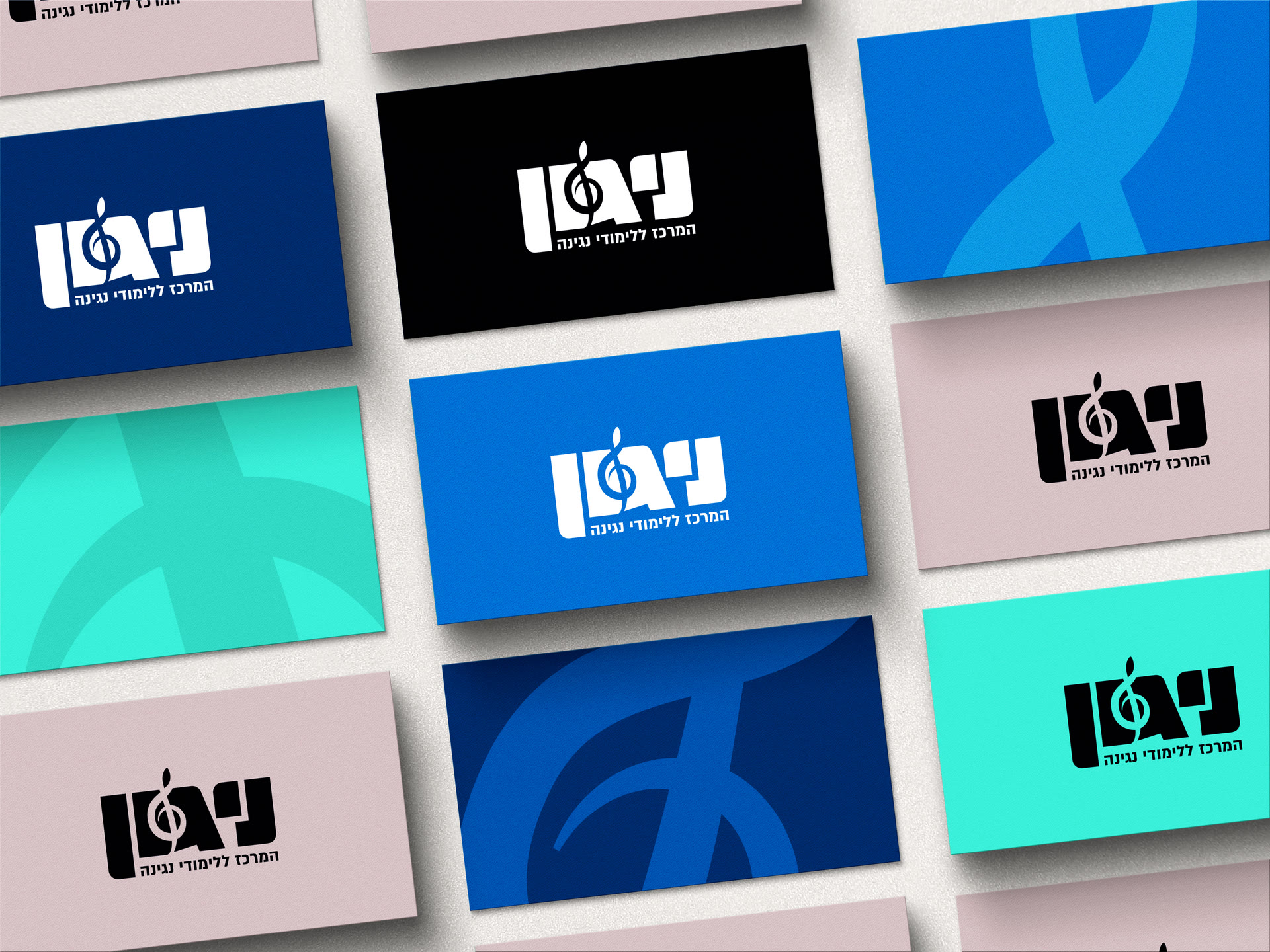
We chose a clean line with a stage presence, to convey the centre’s professionalism and the excitement of playing. We set the treble clef into the space between the vav (ו) and the gimel (ג), so the world of music is there in the name itself. Its curves carry on from the logo into the brand materials, and touches of colour on midnight blue give them the feel of stage light.