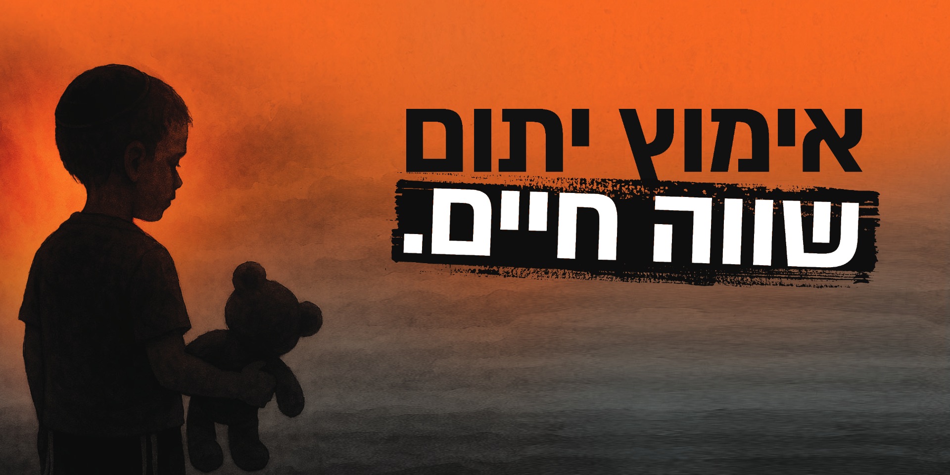



Before the holidays, the pages of the newspaper fill up with requests for donations. Among all of them, the design had to make the reader stop and feel, for a moment, what happens to a child when the holiday comes and the one who was always there is missing. It was important to give the pain its full weight, to keep the children’s dignity and to lead the eye to the chance to help.
THERE IS NO WAY TO SOFTEN THIS
ZE LAZE
01 / ABOUT THE PROJECT
Since 2022 we have designed the campaigns of “ZE LAZE – the home for widows and orphans” throughout the year. Around the existing logo we built a design strategy that gave the organisation a visual voice you can recognise from holiday to holiday. In every campaign we looked for the image that would give its message weight, touch the reader and help them understand what their donation can change.
02 / THE CHALLENGE
THE CHALLENGE
03 / THE SOLUTION
THE SOLUTION
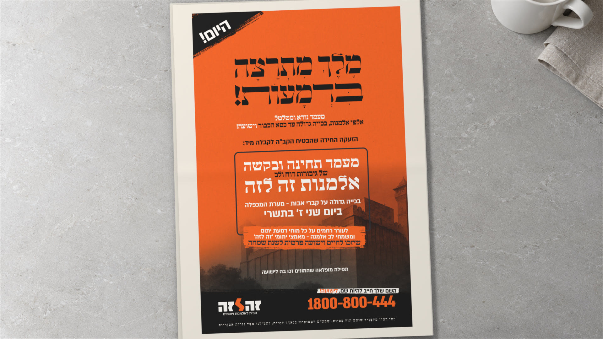
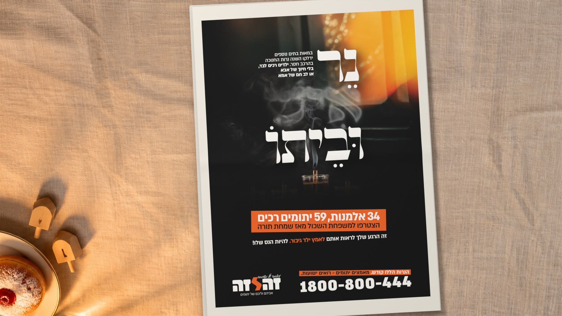
In every campaign we chose one image that can carry the feeling of the message. At Hanukkah it was a candle gone out. On Lag BaOmer, a child facing a bonfire. In Tishrei 5786, the typography itself carried the pain, even before the words are read.
Around the image we built the reading order. First you meet the moment. Then you understand the size of the absence. From there you reach the call to action, “Adopting an orphan – worth a life”.
04 / THE LANGUAGE
THE LANGUAGE
One central image, typography with presence and very few distractions around it. We brought the warm light back from campaign to campaign. Sometimes it brings out what went out, and sometimes it gives room to hope. So each holiday got its own expression, and every time you could recognise “ZE LAZE”.
05 / HIGH HOLIDAYS 5786
HIGH HOLIDAYS 5786
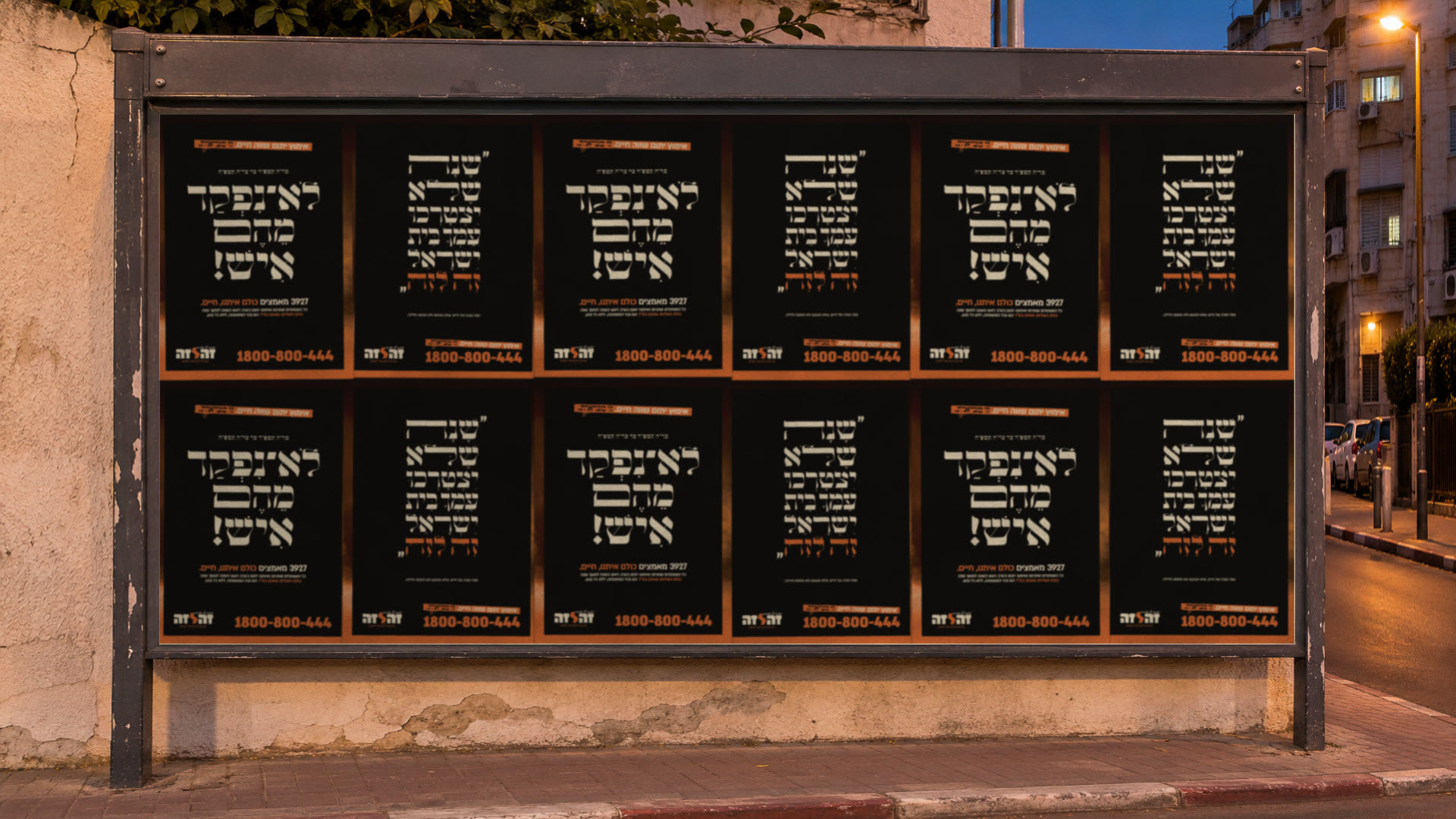
The campaign was built in four stages, from the teasers to the eve of Yom Kippur. At the opening we let the words “orphanhood”, “bereavement” and “alone” stand on their own, the pain felt already in the shape of the letters. Then we moved the centre of gravity to the numbers. City after city, the scale of that year’s bereavement was revealed. 434 new orphans and 196 widows.
On the eve of Yom Kippur the design led the eye to the sentence that closed the move. “There is a way to ease this!” The campaign met a wide response and raised many donations.
06 / HIGH HOLIDAYS 5785
HIGH HOLIDAYS 5785
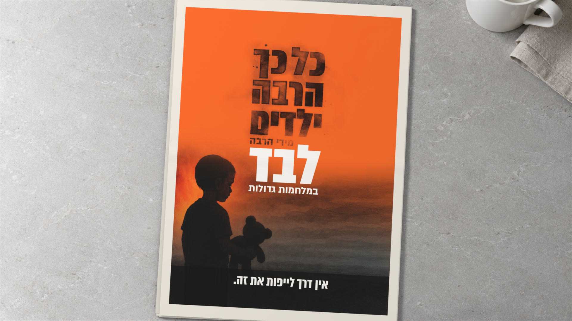
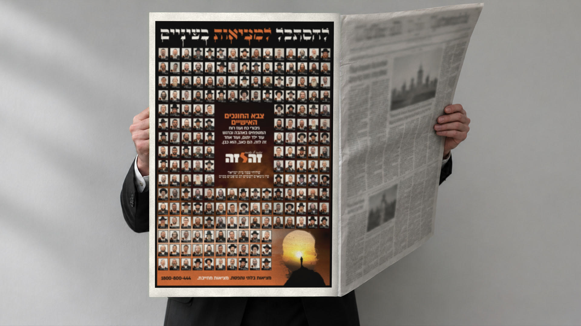
We arranged the year’s figures around the silhouette of a child. So even when the numbers fill the page, the child stays at the centre. Then we gave four pages of the daily paper to the personal mentors. After the reader met the scale of bereavement, they met the people who come to the children and are there for them.
07 / HANUKKAH
HANUKKAH
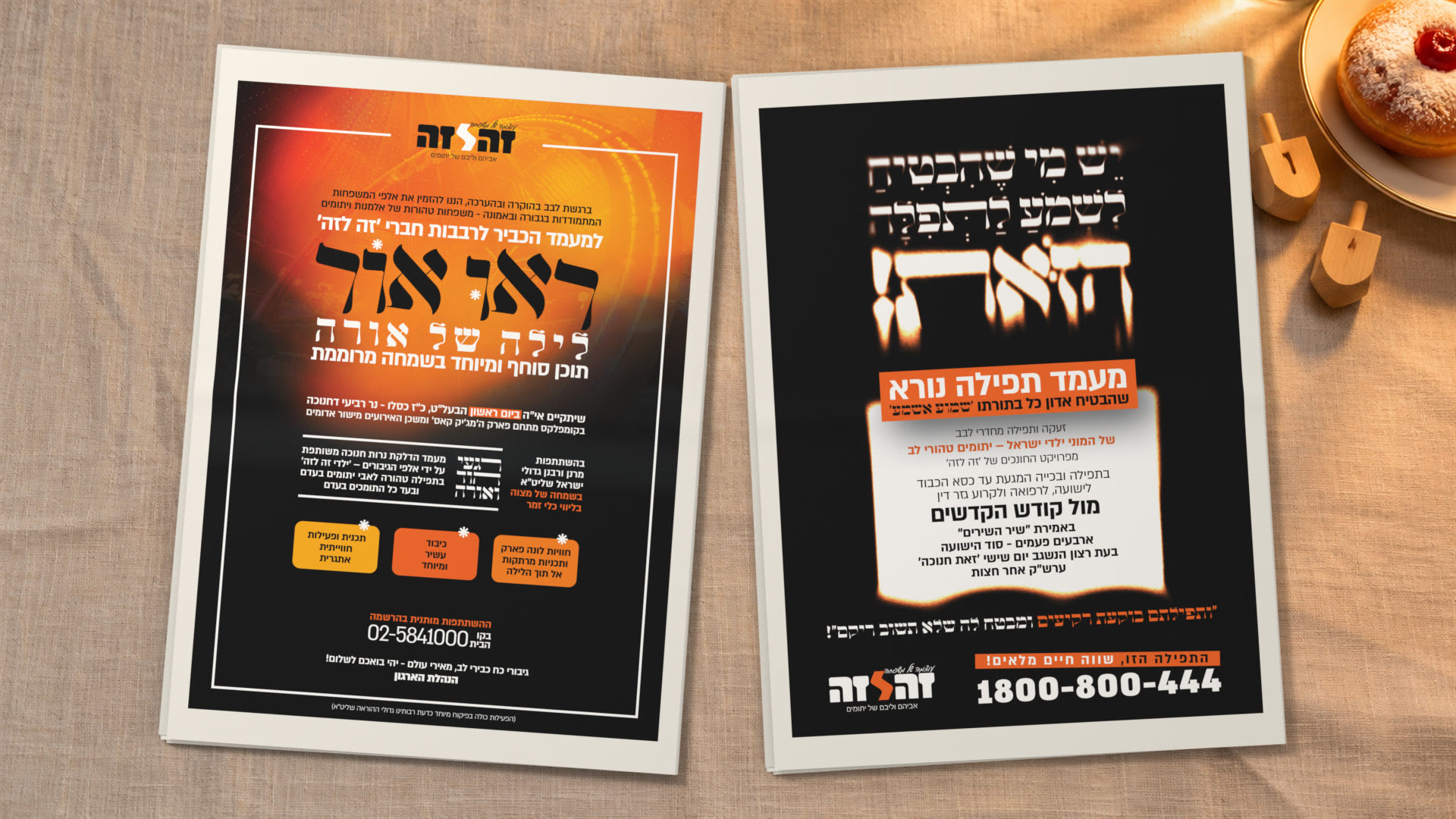
On the holiday when every window fills with light, we chose to focus the eye on one candle gone out. The image gave the absence a shape, and beside it we presented “A Night of Light”, held for the children of “ZE LAZE”. Two moments of the same holiday, with room for longing and for joy.
08 / LAG BAOMER
LAG BAOMER
The bonfire lights the scene, but the eye stays on one child sitting in front of it alone. Through the composition, a familiar moment of the holiday takes on another meaning. Right inside the light and joy of Lag BaOmer, you feel the one who is missing.
09 / HIGH HOLIDAYS 5784
HIGH HOLIDAYS 5784
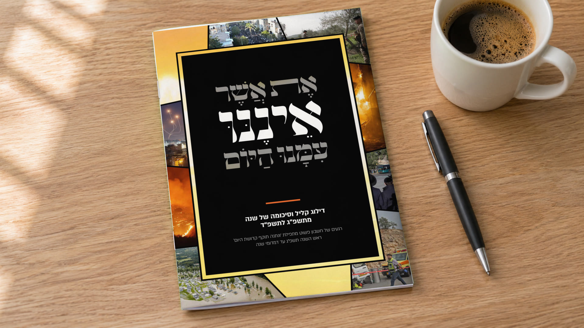
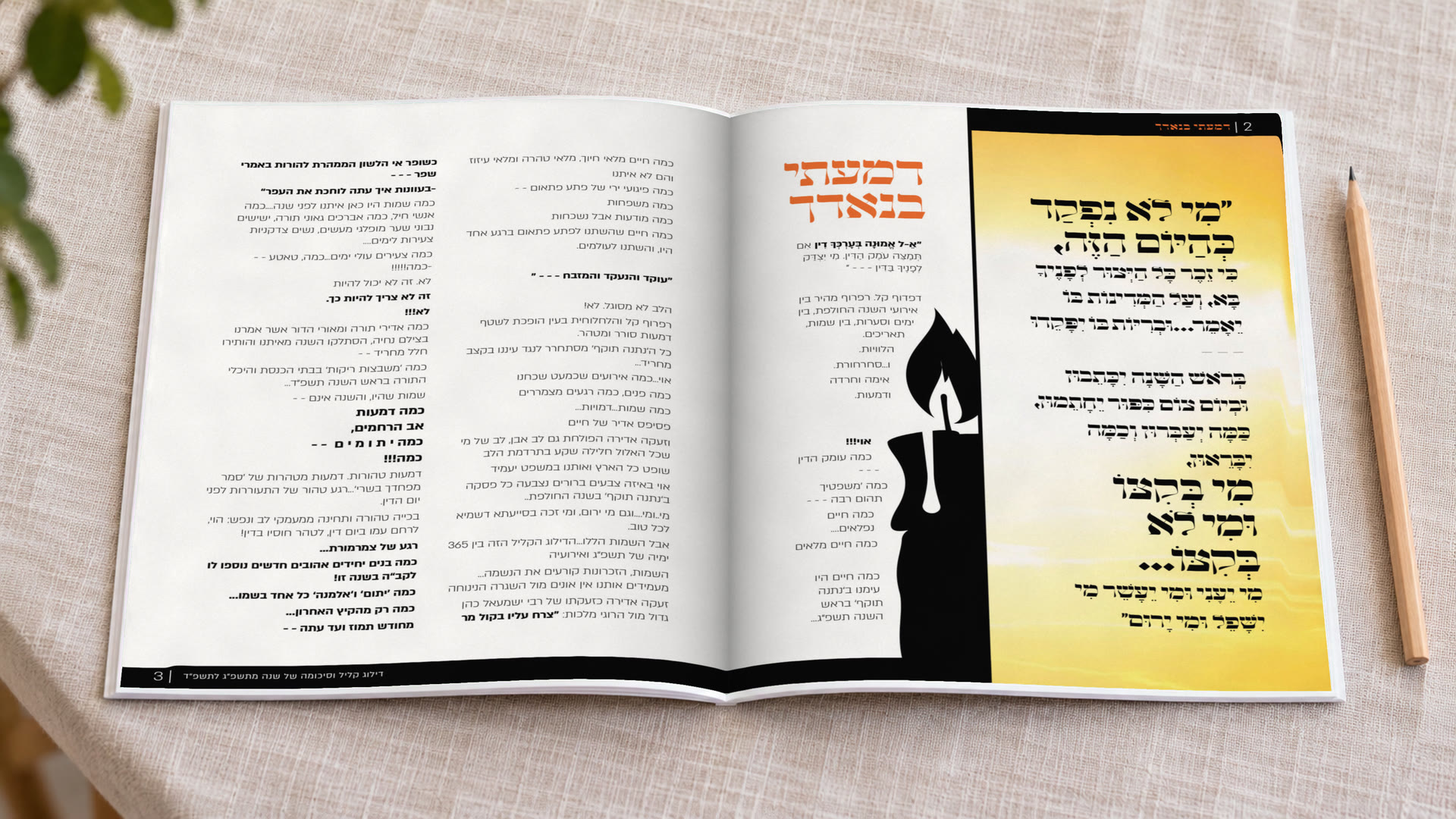
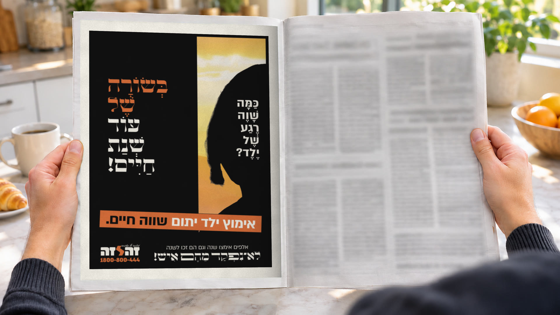
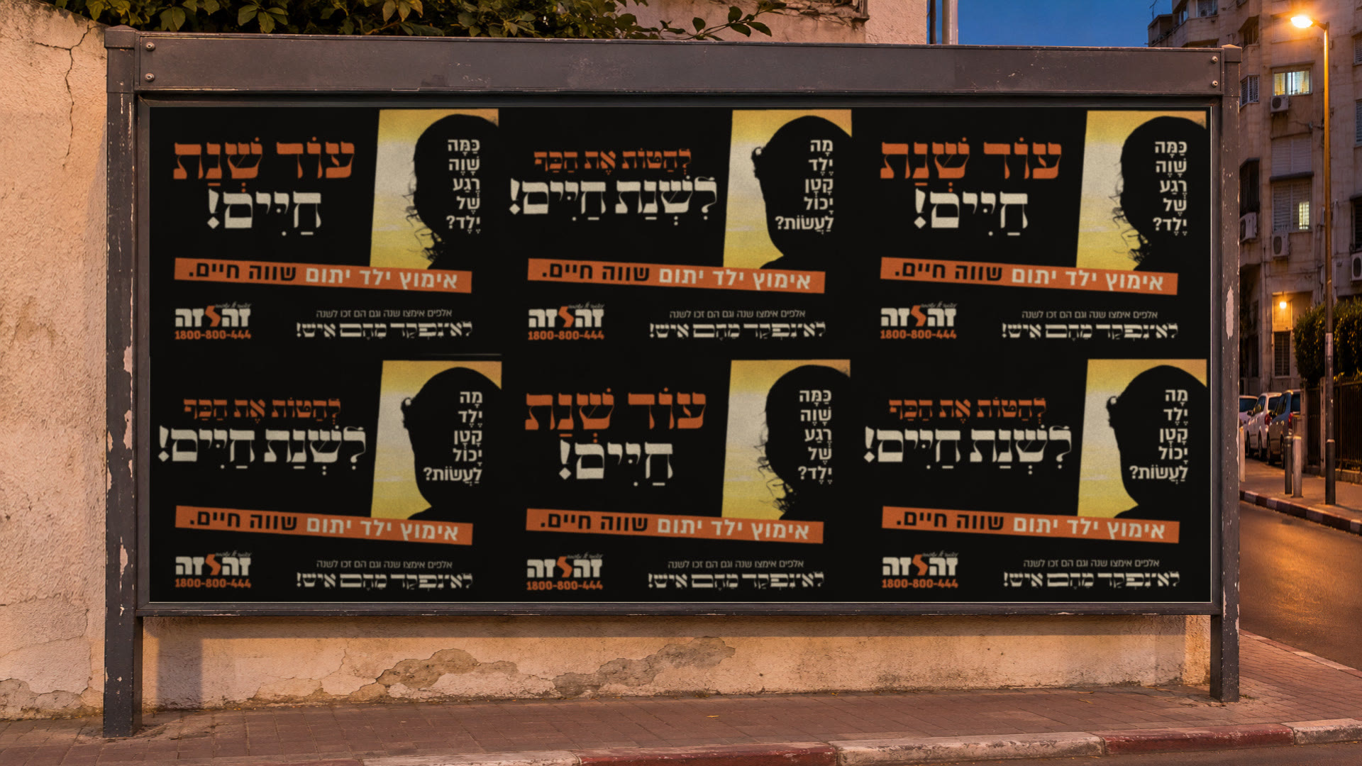
In every ad we returned to the same question and the same image. The silhouette of a child, with a sunset inside it. The repetition gave the campaign a recognisable look, and the image held the feeling across the series. The work behind the campaign we gathered in the “Year Journal”, which we designed to sum up the organisation’s activity from 5783 to 5784.
10 / BEIN HAZMANIM 5783
BEIN HAZMANIM 5783
11 / TESTIMONIAL
WHAT THE CLIENT SAYS
In their own words, translated from Hebrew and otherwise untouched.
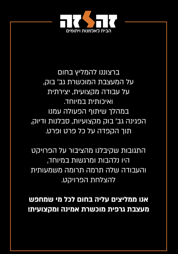
The response we received from the public was especially enthusiastic and moving.
Ze Laze, The home for widows and orphans