



GOOD MARK · EPISODE 01 · SHAPE
COCA-COLA
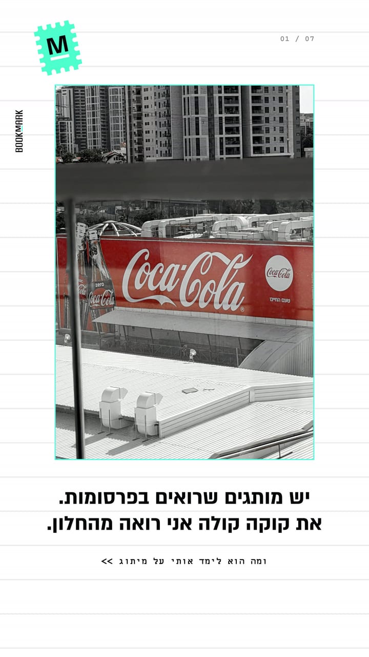
Some brands you see in ads. Coca-Cola, I see from my window.
· SHOSHI BOOK
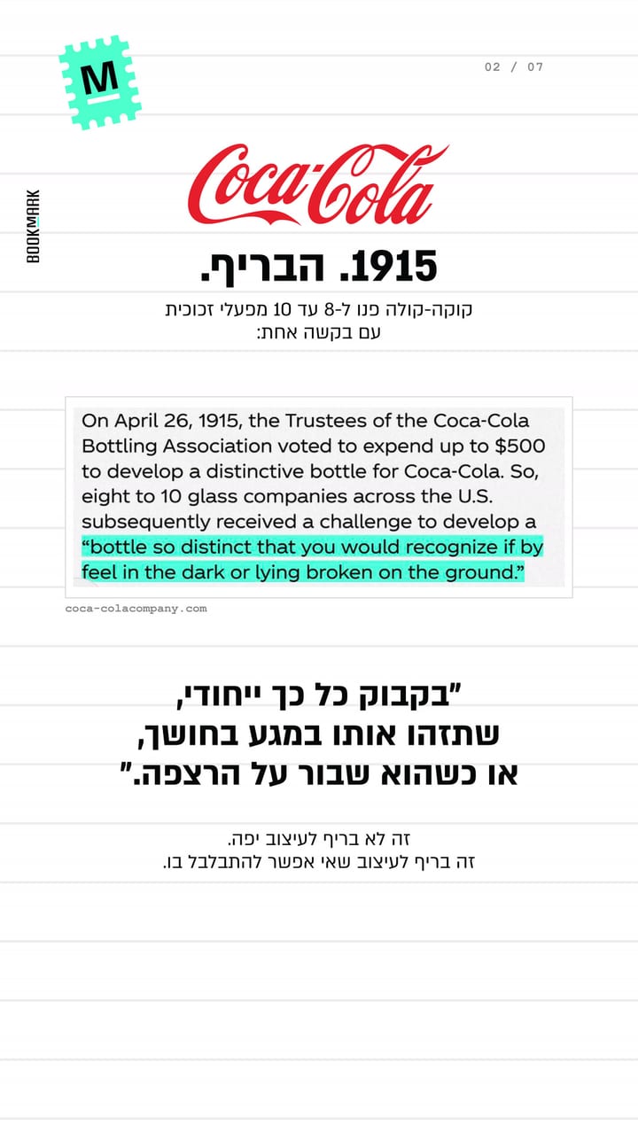
1915. The brief.
Coca-Cola went to eight to ten glass companies with one request: “a bottle so distinct that you would recognize it if by feel in the dark or lying broken on the ground.” That is not a brief for a beautiful design. It is a brief for a design no one can mistake.
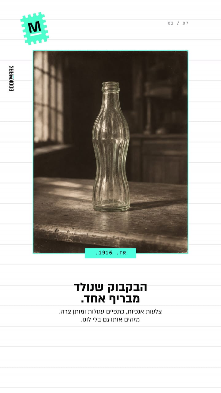
Then. 1916.
The bottle born from a single brief. Vertical ribs, round shoulders and a narrow waist. You know it even without the logo.
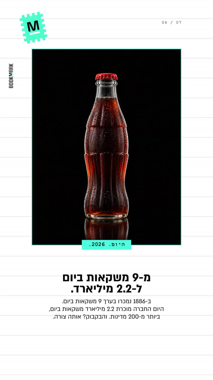
Today. 2026.
From 9 drinks a day to 2.2 billion. In 1886, about nine drinks a day were sold. Today the company sells 2.2 billion drinks a day, in more than 200 countries. And the bottle? The same shape.
The ad. 2020.
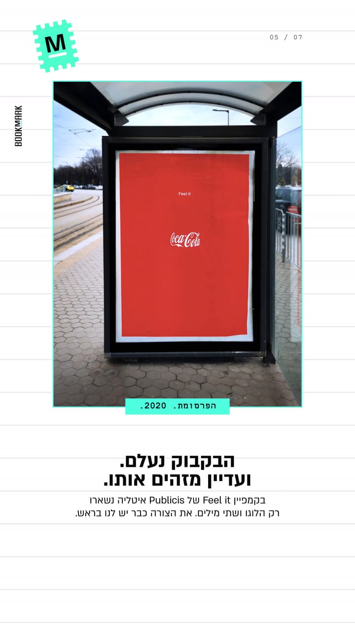
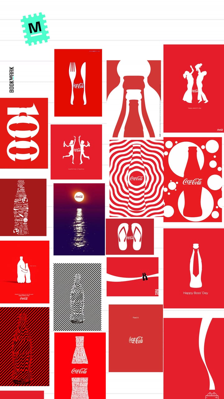
The bottle disappeared. And we still recognise it. In Publicis Italy’s “Feel it” campaign, only the logo and two words remained. The shape is already in our heads.
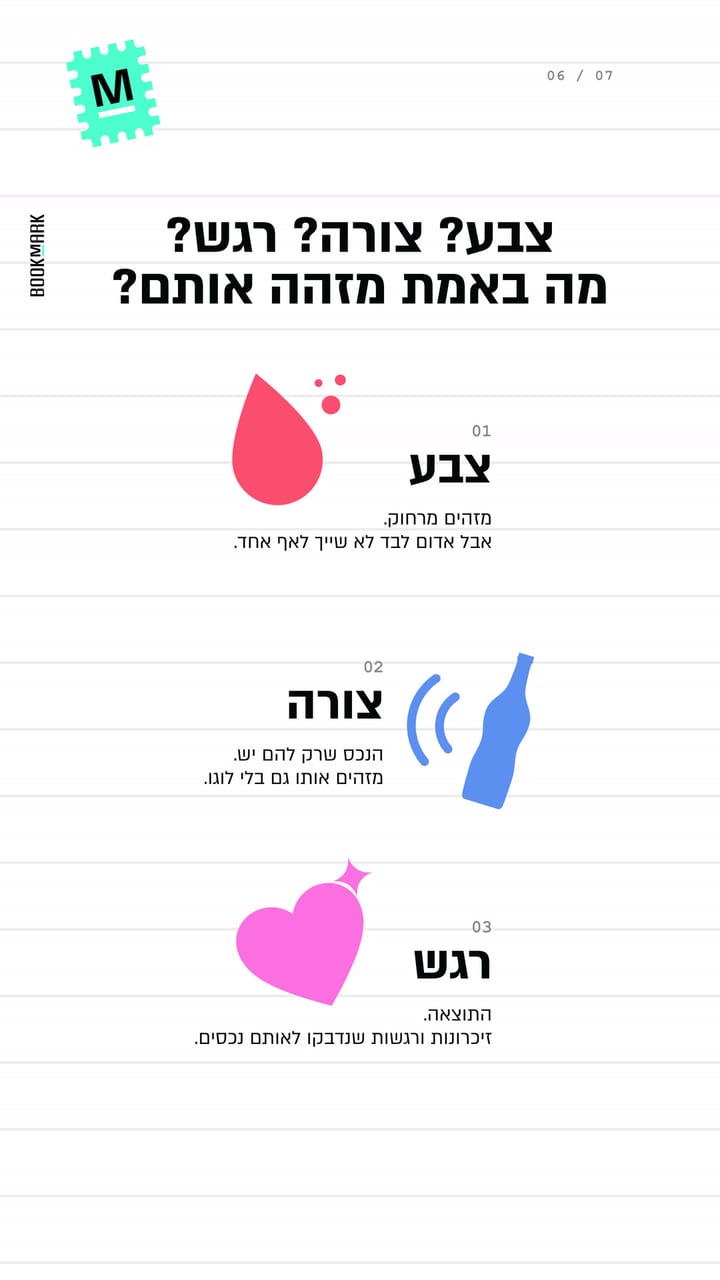
Colour? Shape? Feeling? What really makes them recognisable?
- 01
COLOUR
Seen from afar. But red alone belongs to no one.
- 02
SHAPE
The asset only they own. Recognised even without the logo.
- 03
FEELING
The result. Memories and feelings that stuck to those same assets.
The secret is consistency.
Clear, distinctive assets that repeat for long enough become the feeling that connects people to the brand.