


Some 3,000 apartments were under construction in Rechasim, most of them in large complexes on Givat HaParsa. Across the three target audiences we found a shared wish. Families wanted to move into a new apartment and stay close to the community and the centre of town. That connection made the location the project’s main advantage.
ENJOY EVERY DEGREE
RECHASIM 360
01 / ABOUT THE PROJECT
APEX has been building in Rechasim for years. For its new project, which includes three buildings and 54 apartments where old and new Rechasim meet, we developed the strategy, the name, the visual language and the sales campaign.
02 / THE CHALLENGE
THE CHALLENGE

03 / THE SOLUTION
THE SOLUTION
The name “Rechasim 360” gave expression to the perfect living experience the project offers. A new apartment in a boutique complex of three buildings, in a central location that lets you stay close to the community.
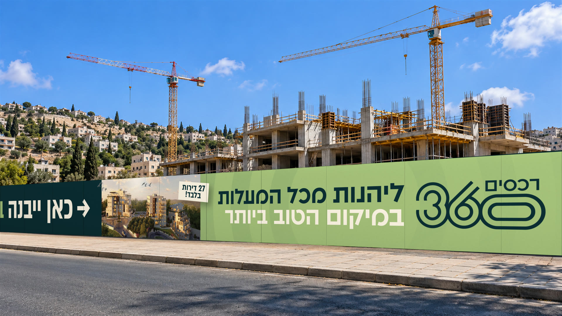
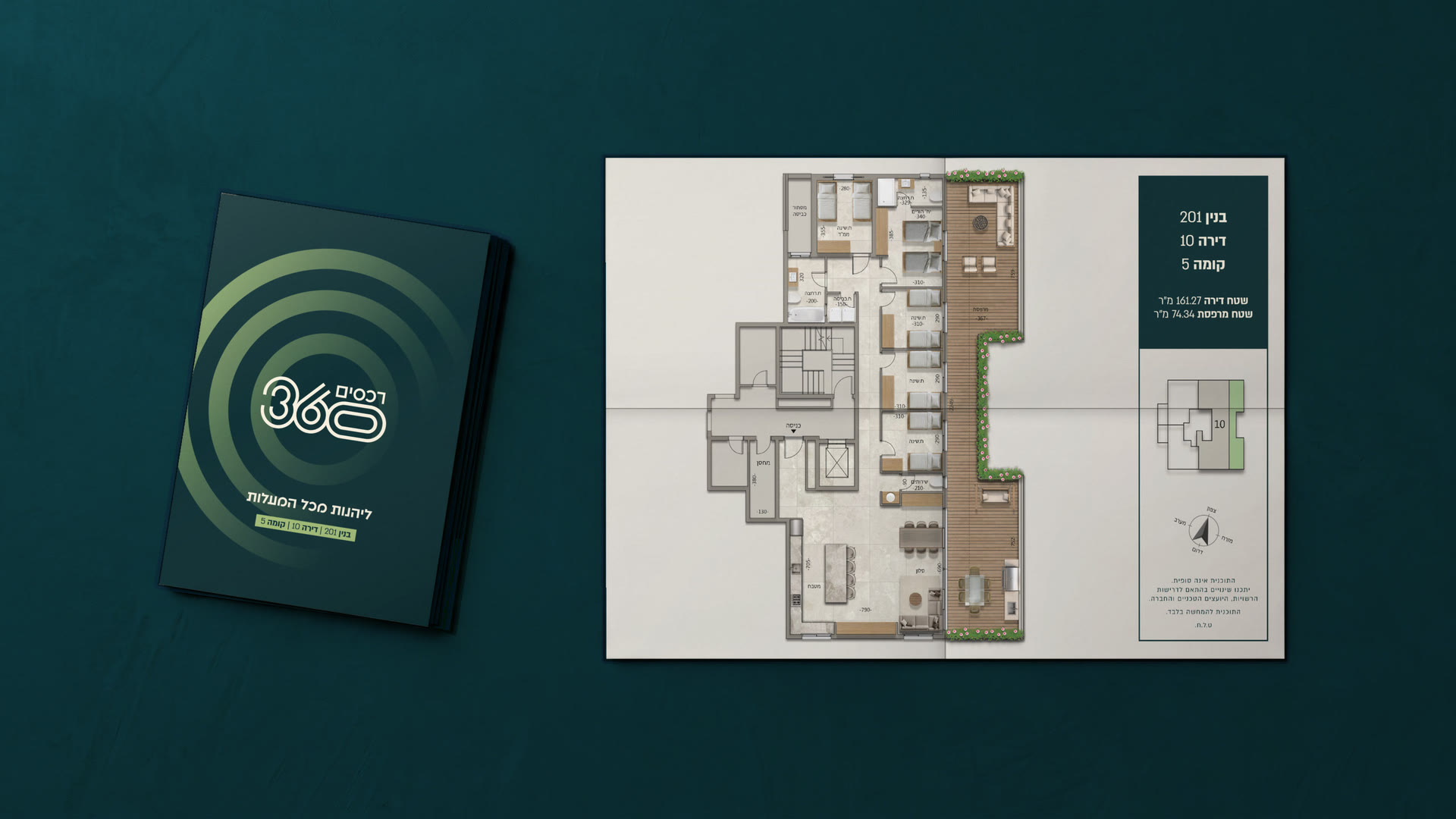
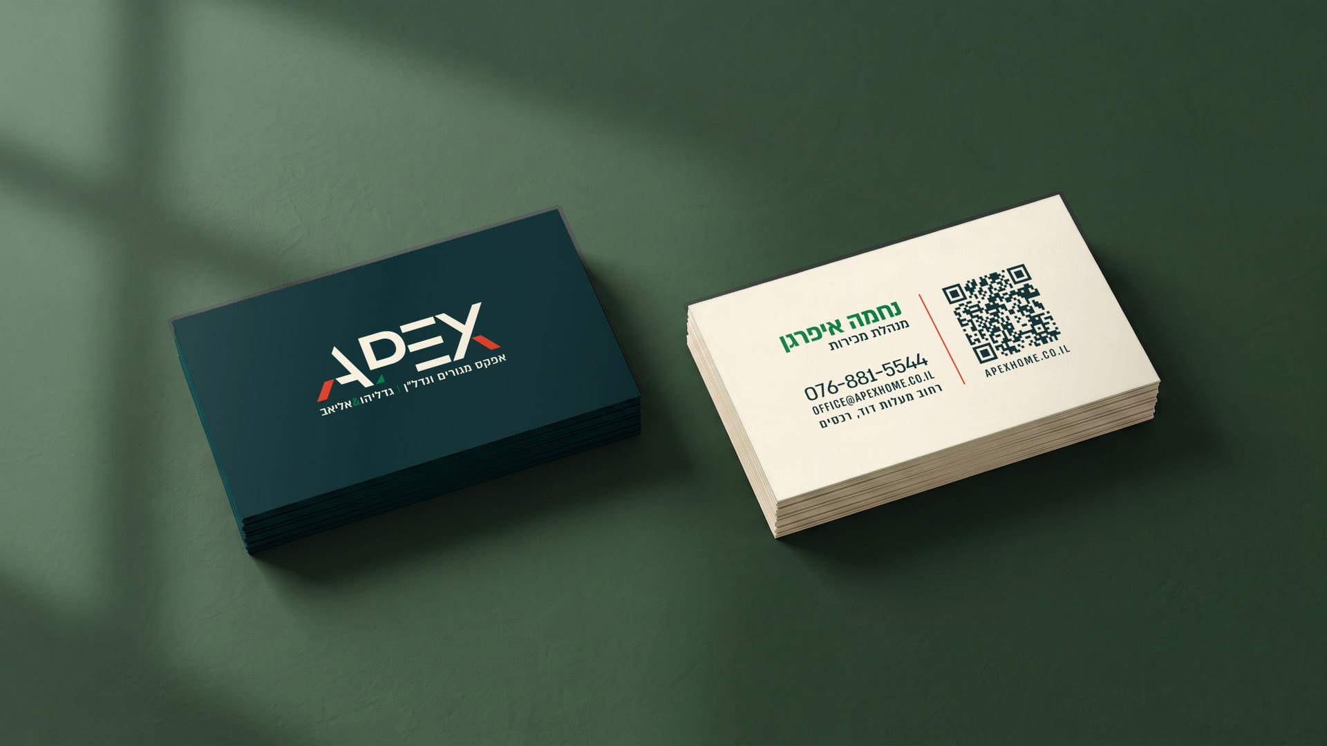
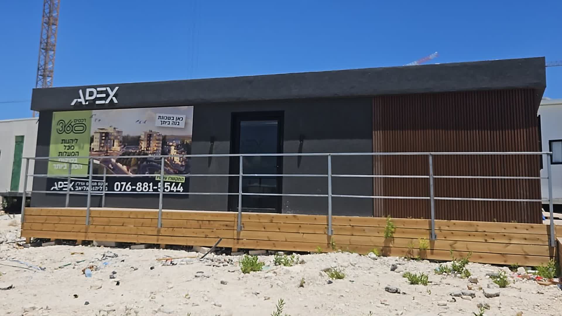
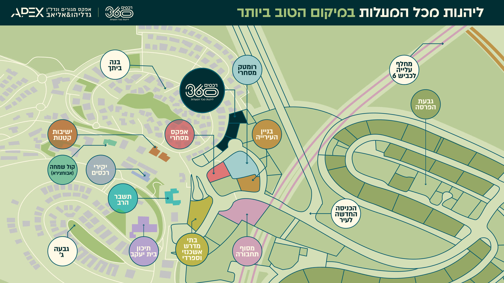
In the campaign we brought the promise to life at two scales. The location map showed where the project stands in relation to old and new Rechasim, and the renderings and floor plans let you come closer and see what the home itself will look like. The same language carried the campaign from the signage and the ads to the sales office and the project’s page on the APEX website.
04 / THE PROMISE
THE PROMISE
A 360° living experience. A new home in the best location in Rechasim, close to everything that matters to you: the established community, the places of learning, the business and retail buildings and the entrance to town.
05 / THE LANGUAGE
THE LANGUAGE
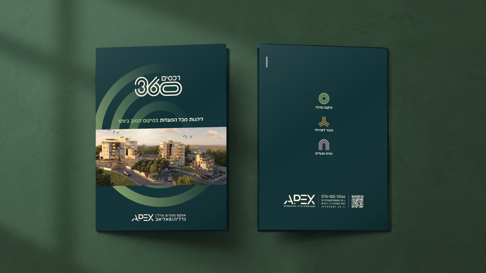
We chose a visual language that brings out the project’s main advantage. The target mark the logo is built from puts the location at the heart of the identity, and the colours give expression to the three advantages of living there. Green for location, gold for community and pink for the living experience. That way the same message runs from the site hoarding to the floor plan.