


When you shop for several members of the family in the same store, you need to find what suits each of them easily, and know that the whole purchase stays within budget. The challenge was to build a fashionable, recognisable identity that works in every department and expresses the value the chain offers, also when buying through institutions and organisations.
DRESSING THE DIFFERENCE
FINELINE
01 / ABOUT THE PROJECT
FINELINE is a fashion chain for the whole family, from babywear to adult fashion, alongside textiles and accessories. We developed a name and a visual identity for the chain that express its promise. Quality fashion at a price that suits shopping for the whole family.
02 / THE CHALLENGE
THE CHALLENGE
03 / THE SOLUTION
THE SOLUTION
The name FINELINE joins FINE, quality and style, with LINE, one clothing line that connects the departments. We built a language that lets every category take a colour of its own and still be recognised as part of the chain.
We applied the identity from the labels and the bags to the shop front, the posters and Instagram. In the brand book we set out how to use the language in each of these applications.
04 / THE LANGUAGE
THE LANGUAGE
We chose a clean, fresh line to convey style and make it easier to find your way between the departments. The three rounded lines of the E recall folded shirts in a pile. When the same shape repeats and interweaves, it creates a pattern that recalls woven fabric and gives FINELINE a recognisable mark beyond the logo.
05 / TESTIMONIAL
WHAT THE CLIENT SAYS
In their own words, translated from Hebrew and otherwise untouched.
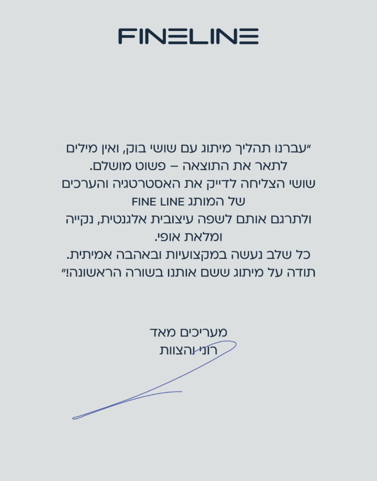
Thank you for a branding that put us in the front row!
Roni and the team, FINELINE